
Built from shapes
The mark decomposes into seven filled shapes: a crown, an S ribbon and five narrowing thread flanges. No strokes and no effects, so it holds in solid black, in embroidery and at 32 px without being redrawn.
Brand identity · MIDO Design Labs · 2026
One master identity. Every lockup derives from the same icon geometry and the same outlined wordmark. Only layout and colour treatment change. The mark is contour-traced from the approved reference rather than redrawn, so the silhouette that goes on the door is the one the client signed off.

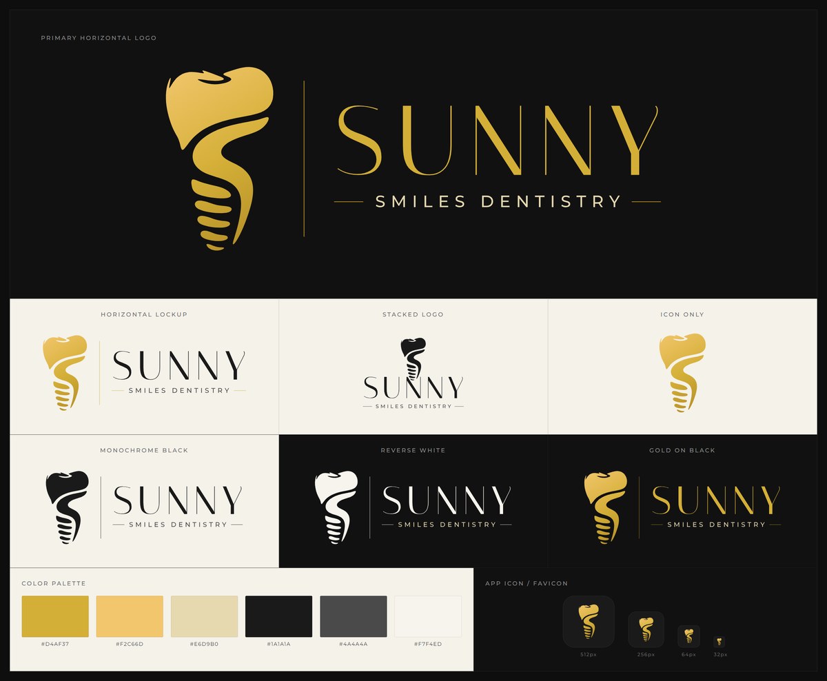
The mark decomposes into seven filled shapes: a crown, an S ribbon and five narrowing thread flanges. No strokes and no effects, so it holds in solid black, in embroidery and at 32 px without being redrawn.
At 64 px and below a second cut drops the smallest thread flange, so the remaining threads stay distinct instead of blurring into grey. The favicons already follow that rule.
All type is converted to outlines, so no font files travel with the artwork. SVG, transparent PNG at four sizes, a multi-resolution .ico and signage minimums are in the pack.